Friday, 18 May 2007

My day at Race for Life.

Now to "My" day. My local "Race" was Inverness and heres how it felt for me on the day:

We arrived in good time, infact an hour and a half before the warm up was due to start, but we are very glad we did as not long after we arrived it started getting really busy. It was, as I had been told, an amazing atmosphere, as everyone there is there for the same reason with the same goals, raising as much cash for Cancer Research UK as possible.

When I stepped out of the car to get my bag out I had a wonderful suprise, my niece and her husband had travelled all the way up from the Borders to support me, so I had plenty of support including my Mum my Sister in law and a friend of my mum's, it was lovely to have familiar faces there.(For those of you who don't know me, I did this race this year in memory of my brother who died of cancer at the end of October last year).

After an short hold up, we began the warm up, the biggest aerobics class I've been in with over 3000 people. We were then separated into "Runners" and "Walkers", I had to go with the runners which felt very strange considering I couldn't jog for more that 1 minute 9 weeks ago, and we headed for the start line. The tape went up and we were off, the sun was now shining and the heat, for me, was terrible and I thought at that time I wouldn't make it, but just calmed myself down and took it easy when I needed too. We are very lucky where we are and the whole run was beautiful, running along the side of the River Ness. 
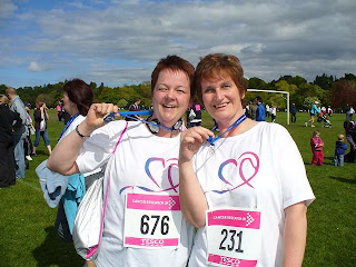
(I'm the one adjusting my headphones!)

I was amazed at the amount of children and young girls taking part in the race and they all were amazing, running alongside there mums/aunties/friends, and whizzing past me I may add! Reading the back signs on everyones t-shirts is very emotional, I liked the ones that simply said "I race for life for..... those who can't"

Anyway back to the race, we had so many lovely spectators clapping and cheering us on, it was a real boost to the system, it felt strange, but good. Coming down that last 1/2 mile or so seemed to take forever, you can see the finish line but its far away, but we carried on heading for the "sacred" blue inflatable finish line, my family were there cheering for me as I crossed it in 35 mins and 32 seconds! Unbelievable (for me), I had hoped for around 40 mins, so I was well below that, so the 9 weeks of training paid off.
Would I do it again? too right I would, and I am looking forward to next year where my daughter is coming with me - although my niece is trying to persuade me to do a 10k with her next October - we'll see.

In the end, my friend and I raised over £1600 - and feel very VERY proud. Now...what are you waiting for? click those links in the post below and do something special for yourself and others. Remember you can walk if you want or sprint in with the front runners, its your day to enjoy as you wish.

Race for Life?

Race for Life. What is it?

The Race for Life is the country's biggest woman only charity event with 280 separate events taking place from May to August. Its run in aid of Cancer Research UK, and has raised over £100,000,000 since it started in 1994. This year they are hoping that 800,000 women will pop on there running shoes and walk, jog or run the 5K course (3.1 miles - its longer than it sounds!!) raising as much money as they can.

There will be a race near you, so if you fancy joining in the fun and helping raise funds to try to beat this dreadful disease click here and sign up today. If you can't manage yourself and see a "I race for life" or similar in someones signature line click on there link and donate today you'll be glad you did.

If you want to, take a digital watch and time yourself, although, with huge crowds and varying ways of getting to the end you wont be setting yourself a new personal best! Just walk, jog run and enjoy the atmosphere and the day.

Remember these frightening stats: 1 in 3 of us will get Cancer in our lifetime and 3 in 4 familes will care for a loved one with Cancer. Its a scarey thought and one that affects all of us!

Introduction to Cath

Hello. I'm Cath, and I live in the Highlands of Scotland. I've been crafting all my life really, and have tried most crafts. I knit (although not since I started scrapbooking), do cake decorating, paint, make cards, scrapbook, but don't crochet, never could do that.

I have been part of the Suprise Supplies DT, an occasional entrant in Altered Treasures DT and work on the Pencil Lines sketch blog.

I'm married 16 years this year, and have a teenage daughter, nearly teenage son and a re-homed westie dog called Rosie (she's a handful in herself!).

I'm thrilled to be involved in the Jelly Journals and love the way its taking shape.

Thursday, 17 May 2007

Layout Balance - Fixing the Mistakes!

When writing articles for this blog, I’ve chosen to research things that I would like to know more about. This is why I have decided to write a series of articles on achieving balance in your layouts. When trying to design new and innovative layouts using eclectic materials, I sometimes struggle to achieve what I consider to be pleasing design elements and balance. I therefore thought it might be an interesting topic for others who may also struggle with the same things.

I will often look at a layout and think – “Ok, I’ve finished!” yet when I go to upload my layout on-line, I look at it onscreen from a different perspective and think “oh no – there is something missing!” You ask your friends “what’s wrong with this?” and they will appreciate it as it is, because it is something you have hand made – and they like it! However, this is not always helpful when trying to gain an honest critique when something niggles – and I usually have to sit there for a while, or maybe come back to the layout after a significant break, and have another fiddle, in order to see just what the layout might have been missing.

I wanted to delve into more of the science and the principles of graphic design, in relation to scrapbooking. However, as this subject is quite in-depth, I have decided to break it down over a number of weeks, and I’ve taken quite a lot of material from John Magnik, a compositor and teacher who teaches principles of graphic design. His site is here, but I am going to adapt the material specifically for scrapbooking.

This week, we will talk about visual weight. I am also going to show you some befores and afters to provide some examples.

Visual Weight:
Graphic designers use the terms “visual weight” and “visual balance” – where things are placed in connection to the layout space. Something that has a lot of visual weight is dark, or large – your eye is drawn to this and rests for a longer period of time than for something which is small, or light.


Look at this layout – this was my first attempt.


Now – I am not asking you to critique my scrapbook page – this is using my oldest wedding stash, and the photos are some candid night time shots at my wedding – so I started off with less than premium materials. The photos are not well composed – there are chairs in the way, and they are full of red eye. I made this page from a class on the recent UK Scrappers cybercrop, but I decided to change the page quite considerably, in order to better suit my own purpose.

Being that I have all this stash in place for my wedding scrapbook, I am determined to use it - even though I may not love it as much as once I did. So, I popped the stickers onto cardstock, cut the letters out, outlined the letters in ink, and raised them onto foam pads to add more depth. I added eyelets into the scallops for more detail.

The ribbon and key detail was recycled from a lovely handmade card sent by a friend.

I added the prima flowers and stickers strategically - to block out bits of the photos I didn't want to see. But when examining or self-critiqueing the page when I thought I had finished, my layout didn't look balanced. The curve on the right hand side of the semi-circle means that there was more space and there were less elements on the right hand side - I felt it needed "more visual weight" to make it look balanced. But how?

I fiddled and faddled for a while - and then came up with the idea of adding more cornflower ribbon, which partially achieved the trick, because it was a darker colour, and thus drew the eye - but it still needed more.

The addition of threaded beads weaving their way on the right hand side really worked for me - and thus gave the layout a finishing touch, and I felt it added the "wow" factor. Here it is in more detail -

And so I was finally happy with the end result, after some considerable time.

I have added more visual weight to the right hand side of the page, in order for it to be balanced with the elements of the left hand side. So, after some considerable faffing - I am pleased with the end result - and happier to know WHY my layout didn't work in the first place!


Next week, we shall talk more about visual balance, and I shall be doing some more research into the science bit - and the design principles of scrapbooking! Until then, happy scrapping.

Ali x

Tuesday, 15 May 2007

A LITTLE SEASONING

Isn’t this year simply flying by?? I really can’t believe that spring is nearly over and we will soon be officially in summer.

I live in the far north of Scotland – so far north that a couple more miles drops us unceremoniously off the top of the country and into the sea. I’ve been here for 14 years and this year is the first I remember us actually experiencing a proper spring. Normally we go straight from winter to a poor summer and back to winter again.

I’m lucky enough to have a small nature reserve just a few yards from home where I normally walk the dog. It’s the sort of place that makes you feel good to be alive – there is hardly any traffic noise, the birdsong is so loud and varied, there are lots of rabbits and the occasional deer and, just now, there are new leaves growing and starting to unfurl on the trees.


I think these buds are a gorgeous colour. What a great colour the sky was too.

My favourite parts of the reserve are the wooded areas where the coniferous trees grow. I love watching these trees change over the course of the year. They are usually fairly uniform in colour but each individual tree can vary from dark bluey-grey through storm cloud purple to rich, deep green. They can easily withstand all the elements and we certainly get 'some elements' here!


It's hard to believe this snowfall was only a few weeks ago. The snow reminds me of candy floss that has been spun over the branch.

The time I like best in the woodland has to be spring when the tips of the branches are wrapped tight in a shiny, golden brown covering, like parcels waiting to be opened.


They don’t stay like this for very long and soon bright green, soft, needles emerge from underneath the golden brown.


Aren't they amazing? Most of the trees will look like this - like they have flouncy, multi-layered dresses on with bright green frills swaying in the breeze. Others have these fabulous, exotic looking cones. It could almost be a Mediterranean cactus.


I complain a fair bit about how far away we are from civilisation here - it's a two hour drive to the nearest Marks and Spencer each way, but having this almost on the doorstep helps to make up for some of the hardships!

Monday, 14 May 2007

Chipboard

My scrapping style changed when I discovered chipboard. It is so versatile and forgiving.
As pages normally have titles at present I am using a lot of the Maya Road Chipboard letters, and my 'thing' at the moment is to cover them with UTEE. I painted these letters with Making Memories Lime Green paint and when it was dry I pressed it into a versamark pad and sprinkled with clear UTEE. When it was heated it left a pitted effect which I left as I thought it was scale-like. I did the same with the scrolls which I thought looked a bit like his chin and neck


With this one I used a red UTEE using 2 coats and by the same method as before for the letters and the arrow. The centre of the flower and the photo anchors were from the Basic Grey Undressed Elements and I coated these with Diamond Glaze and sprinkled them with microbeads


Again the scrolls were coated with black UTEE. It gives a lovely rich, glossy finish and before it is completely cold after heating it is nice to sprinkle just a little gold UTEE on the letters to give a rich finish.

They can also be painted, chalked, glittered, painted with H2O's, left bare, decorated with crystals and rub ons. You can punch holes in it for brads and eyelets, tie ribbon and fibre around it. In fact your only limitation is your imagination. But don't just stick with letters, use shapes and flowers. Cut out shapes using a Sizzix.
On this layout the letters were coated with diamond glaze and then covered in glitter and left to dry. The problem with glitter, as you may have found, is that it migrates but with a thickish coating of diamond glaze the glitter sinks into the glaze.
The scrolls I painted with H2O's which gave a shiny, metallic finish and I the added some crystals

Amazing Chickens

My love affair with chickens began around 20 years ago when I saw some little bantams at a show. These daft little creatures really fascinate me and as my husband says ‘ Little head - Little brain but they are comical to watch.
Chickens used to be only kept by farmers and country dwellers but the fancy breeds are now to be found in city gardens as well. Their eggs range from dark reddish brown through pure white to a beautiful blue. The sizes range from monsters to dainty little bantam eggs.
Throw them some scraps or corn and they will scratch around in the garden for hours. I did once have some chickens rescued from a battery farm. When they reach 18 months old their egg production drops off and they are used for food. When I got them home and put them in the garden at first they were very timid as they had been kept in a tiny cage and their beaks cut to stop them from pecking themselves in boredom. Within a short while they were scratching about in the dirt clucking happily to themselves.
But my real favourites are bantams. Over the centuries chickens have been bred into an amazing variety of shapes , sizes, patterns , textures and colours. Some of the cockerels are vicious as they are descended from the fighting birds in the Far East but generally they are happy little birds.
This is a Polish White Crested Blue bantam and Polish have a mop type crest on their heads.

Frizzles have feathers that curl away from their bodies and this one is a Frizzle Polish


or how about these lovely little silkies in a variety of colours